Mamitas Hard Seltzer Branding & Packaging
Mamitas Hard Seltzer Branding & Packaging
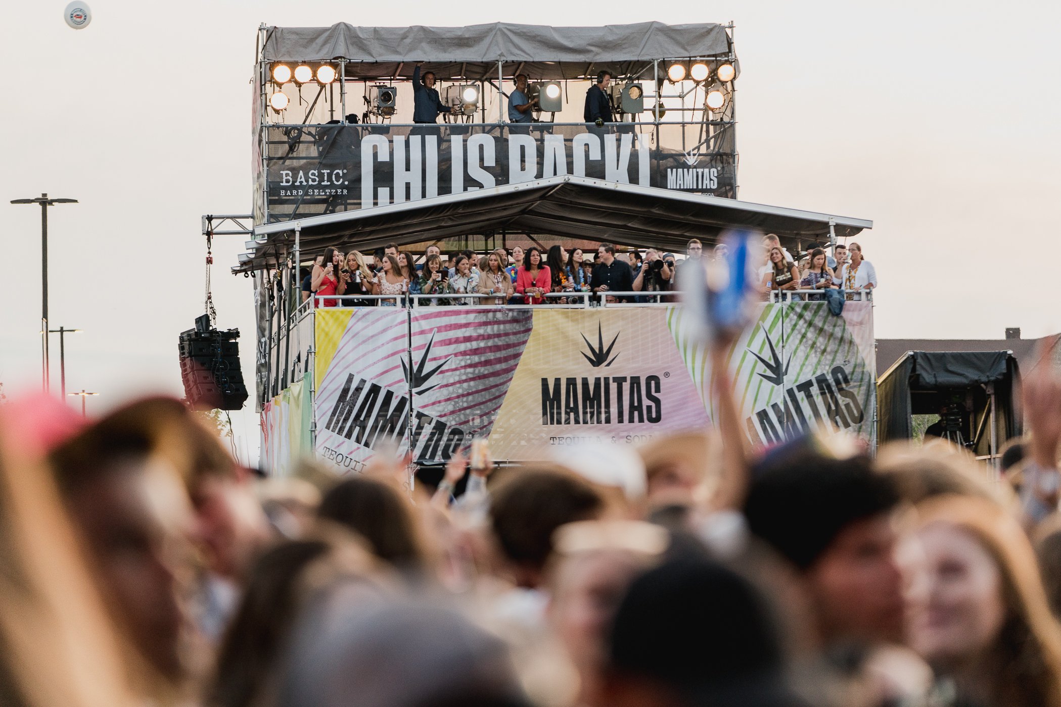
Working with liquor brand giant Phusion Projects, we created the brand, packaging, and experiential activations for Mamitas. Their first ready-to-drink seltzer made with real tequila.
-
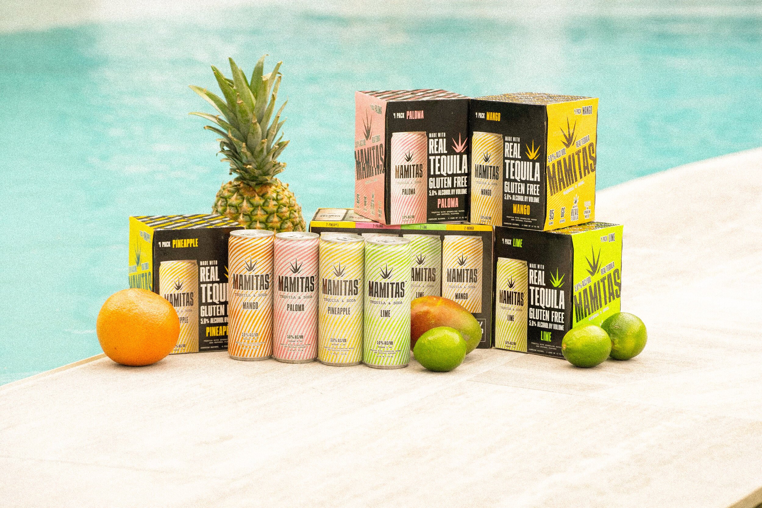
On the coattails of White Claw, the hard seltzer category was being flooded with competition. Our number one goal was to create a product that set itself apart visually on the shelf and enticed potential buyers to try what a seltzer made from real tequila could be.
Mamitas is a brand with latin roots, we built the brand suite to reflect that. Keeping true to the originating culture we made sure that everything we touched was authentic and inclusive while still targeting the American market.
-
Brand Identity, Can & Packaging, Strategy, Partnerships, and Experiential Activations
-
Creative Director, Designer, Strategist
Competitive Review
As our very first step in the process we looked at the competition on the shelf. There was a sea of all white packaging mimicking what had already been working in the seltzer category. By selecting and showing off the bold colors of the tropics we popped off the shelf unlike any other product in the game.


The Logo
Taking direct inspiration from tequilas main ingredient, we used the agave plant to create a crown that sits atop the bold Mamitas stamp.